Jai Losalía


User research, UX/UI Design, Branding, App Redesign
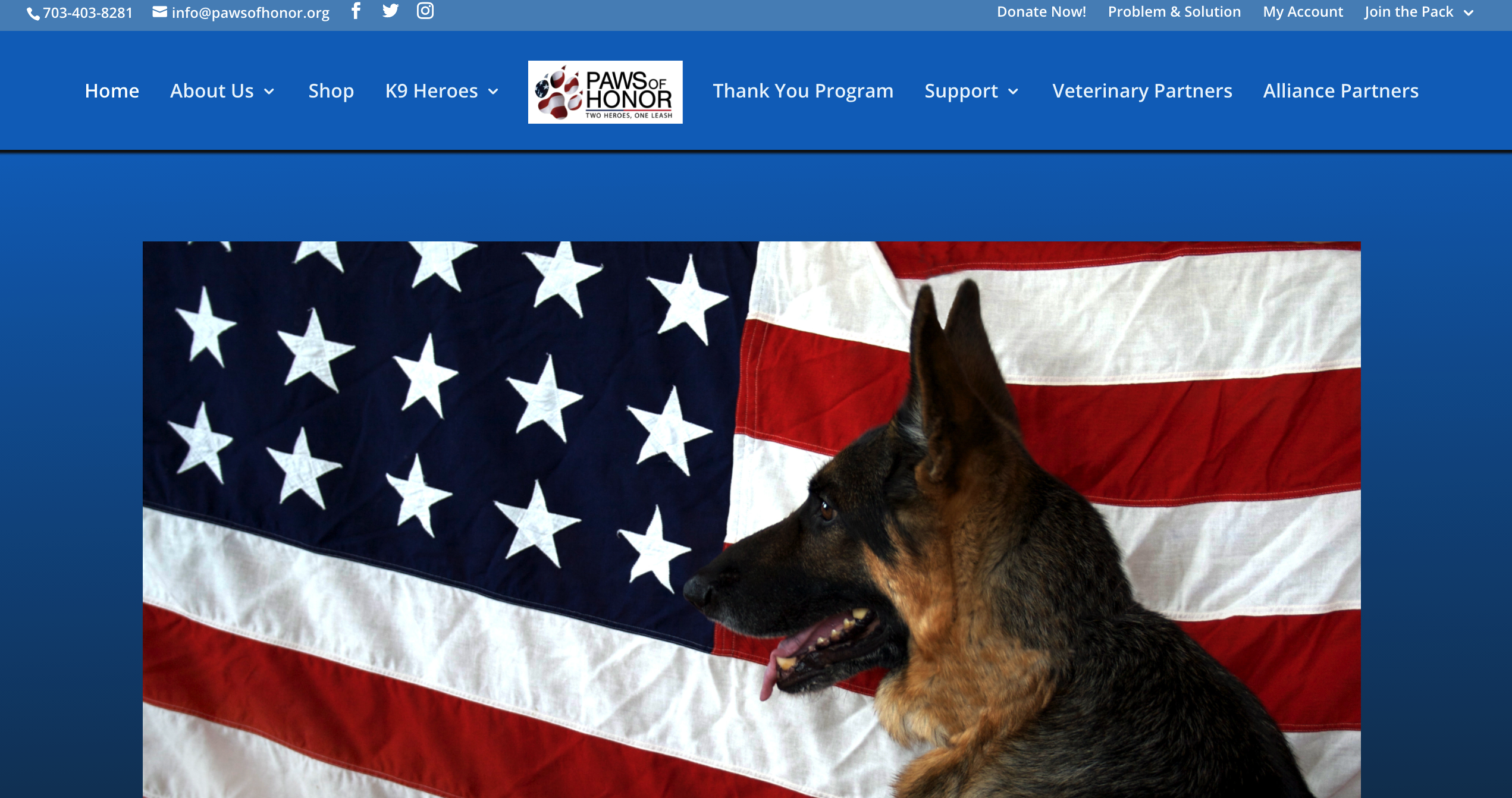
Paws of Honor
2021

Overview
Paws of Honor (POH) is a non-profit organization that provides veterinary care, at no charge, for retired military & law enforcement K-9s across 17 U.S. states. POH was looking from someone to help them redesign their current website.
Problem
What they were looking for from a redesign was a fresh look, to differentiate from competitors, and to primarily increase business key performance indicators (donations, dogs for the program, and veterinary affiliates).
Solution
I created a clear and simple user experience to optimize for the KPI metrics by redesigning the information architecture and rebranding the user interface. My main goal for the MVP was to improve the core features and categorize everything else as stretch goals. This was driven by user research/synthesis, strong brand differentiation, and iteration until achieving the stakeholder’s success criteria.

The old website:


Process
1. Research & Synthesis
2. Information Architecture
3. Interaction Design
4. Prototyping & Testing
5. Iteration
6. Branding & UI Design
1. Research & Synthesis
I started this project with secondary research, including a specific feature competitor analysis to get an overview of the non-profit market and provisional personas to illustrate my assumptions about the target audience at the time.


Next, I did primary research to gain insight into what my target audience is looking for when trying to donate or join an organization. My goal was to better understand what customers expect, want, and need when engaging online. I conducted a survey and user interviews. I chose to survey to understand market demographics and chose user interviews to understand how my potential users think.
SURVEY FINDINGS
- 18 respondents (ages 24-45 years old)
- About 75% of respondents donate online.
- Reputation and trustability ranked the highest importance to customers
- Clear messaging also ranked high to customers
- Most common methods of discovering non-profits to donate to are via brand recognition, organic discovery (talking to friends & family), and TV/Internet/Social media ads.
INTERVIEW FINDINGS
- 6 adults (4 males, 2 females, 24-38 years old)
- Smaller non-profits sites tend to be outdated
- Frustrations occur due to non-transparency on if the money being donated actually goes to the cause
- Trustability mattered the most when donating
- Clear messaging about the specific of the cause is of the utmost importance
- Being able to easily and quickly donate matters highly to users
My design research helped me learn about what to build, how it should behave, appealing messaging and styling, and what makes people want to donate and be apart of an organization.
Following the research, I synthesized my research findings in order to better understand users and their problems. I examined my observations and findings to develop user personas and empathy maps to summarize and communicate all my research findings in a human-centered way.


I created an overlay chart of the key business and user goals, and where they intersected. It was important to identify and keep these shared goals in mind as I moved on to ideation and design phases.

2. Information Architecture
With a better, human-centered, understanding of the problems that needed solving, I generated ideas and potential solutions that would meet both user and business needs. Based on my research and synthesis, I chose to explore three main tasks: donation, signing up a dog, and explore current veterinary affiliates. This is an attempt to highlight the most important aspects of the organization, for this MVP.
I started by creating a priority feature’s roadmap and then created tasks flows to illustrate the key user actions for the top priority business goals; accessing the veterinary affiliate page, accessing the dog recruitment modals, and the, "signing up your dog for the program" modals flow.


I proceeded to conduct a remote open card sort with 10 participants to gain a better understanding of how users would categorize services and features. This led to me designing a high-level sitemap for the application’s information architecture. I cut out the unnecessary page links (seen on the current website's header), to prioritize the main business objectives and sub-categorized the less essential header links.

3. Interaction Design
After defining the key pages and their content, I created the initial responsive wireframes (using column and row grids) exploring a layout for the homepage and the veterinary affiliate page. Based on my research, users wanted understand what the organization did and stood for, quickly. So I reduced the current site's over-messaging and jumped right into the main business points when approaching the UI writing.


I then made the wireframes for the "Signing up your dog" phase (all modals) and created a wireframe for the "Dogs of glory" page.


4. Prototyping & Testing
Next, I wrote up a usability test plan and made a low-fidelity prototype. I ran usability testing on the desktop wireframe prototype with users before proceeding to branding and UI design. I wanted to test if my decisions around information architecture and UI writing would be easy for people to understand and promote max engagement for the business objectives.
OBJECTIVES
1. Being able to quickly and easily donate is POH number one business objective.
2. Being able to sign up new dogs to the program is a key business objective.
3. Being able to see current veterinary affiliates and sign up to be one is a key business objective.
TASKS
1. Examine the homepage and clearly understand POH's mission and all the services they have to offer.
2. Navigate to the "Dogs of glory" page and sign up their dog easily.
3. Navigate to the Veterinary affiliates page, see current affiliates, and sign up to become an affiliate.
QUANTITATIVE RESULT
I had 5 participants test the prototype. All tasks had a 100% completion rate, and the error-free rates for tasks 1 through 3 were 67% (2 out of 3), 67% (2 out of 3), 100% (3 out of 3), 100% (3 out of 3), and 100% (3 out of 3), respectively.
QUALITATIVE RESULTS
After conducting one-on-one sessions, I noticed that some people did not like the formatting of some of the information. I gathered and organized several pages of qualitative findings in an affinity map to visually group and prioritize similar observations and feedback in a way that would help me zero in on the priority revisions intended to improve usability and the overall user experience.
From the results I gathered, I made an affinity map to help me pull out the common threads and recurring themes. I was then able to identify key insights and recommend revisions to address each one.

5. Iteration & Implementation
I iterated and implemented revisions gathered from the testing, resulting in updated wireframes and moved to branding & UI design. Due to a tight deadline, I wasn’t able to run another round of testing otherwise I would’ve tested 5 more participants after the branding phase to learn and iterate more until achieving maximal results.
6. Branding & UI Design
After testing, I designed POH's brand identity based on the company’s core values, patriotism and retired working dogs. I created a mood board on Pinterest that reflected a number of brand adjectives I identified. I wanted to differentiate POH from their competitors (all of them used a combo of red, blue, and white). I led with a theme derived from freedom and implying the gold standard.

POH's logo design process was re-branding their newly created logo that they sent me. I added those previously mentioned themes to a new logo design. With the visual styles defined, I applied these UI design choices to the wireframes, creating high-fidelity responsive UI designs. To increase productivity and communication between me and the developers, I made a UI kit with all UI components.


Conclusion
WHAT I DID
- Primary & secondary research
- Information architecture
- Wireframing & interaction design
- Prototyping & testing
- Iteration & implementation
- Branding & UI design
WHAT I DIDN'T DO
- Run multiple, 5 participate, rounds of usability testing
- Conducted A/B testing
- Design “filing a claim” prototype
- Re-test the updated hi-fi prototype
- Build the application
NEXT STEPS
- More usability testing and iteration
- Design more pages of the application
- Work with developers to build and launch the application
- After site re-launch, check in with the stakeholders to see if KPI metrics increased
User Flows:
Homepage flow
Examine the homepage and clearly understand POH's mission and all the services they have to offer.
Signing up your dog flow
On the "Dogs of glory" page, being able to easily and quickly sign up their dog.
Other selected works


