Product strategy, UX/UI Designer, Integration
Airbnb
2021

Overview
Airbnb is an online marketplace for lodging, primarily homestays for vacation rentals and tourism activities. If Airbnb operates in the travel space, why doesn’t it include booking flights? If a flights feature was properly leveraged, it could drive primary business growth such as acquiring and up-selling new customers on lodging, list the airfares via Google search, and much more.
In this concept project, I will attempt to vertically integrate a flights feature into the iOS app to help Airbnb become an end-to-end travel platform.
Problem
How might we go about integrating this complex feature? Questions to consider, should we bundle flights and lodging, how would this seamlessly fit into the existing Airbnb app flow, and how to keep Airbnb’s brand reputation high when dealing with user’s air travel volatility.
Solution
From user research to UI design, I designed and prototyped methods for users to browse, book, view, and edit flights seamlessly within the current Airbnb iOS app (2021).

Process
1. Research & Synthesis
2. Information Architecture
3. Interaction Design
4. Prototyping & Testing
5. Iteration
6. Branding & UI Design
1. Research & Synthesis
I started this project with secondary research and performed a competitor analysis to get an overview of the current online travel market, by examining the most-used services.

Next, I did primary research to gain insight into what my target audience is looking for when shopping for travel. My goal was to better understand what customers expect, want, and need when booking for travel. I conducted a survey and user interviews. I chose to conduct a survey and user interviews, to understand market demographics and to understand how online travel shopper think, respectfully.
SURVEY FINDINGS
- 25 respondents (ages 18-37 years old)
- About 90% of respondents shop for travel accommodations online; 10% shop exclusively over the phone with an agent.
- Price, reputation, and brand dependability ranked the highest importance to customers
- Easy and quick to understand user interfaces also are important to customers
- 60% of people travel at least three times per year
- Popular flight booking tools include Google Flights, Kayak, and Expedia
INTERVIEW FINDINGS
- 5 adults (3 females, 2 males, 19-33 years old)
- 85% book lodging accommodations first, then book the flight
- Use Google Flights to browse
- Price mattered the most when choosing a booking provider
- A major concern is what brand to trust. The travel service needs to have a strong customer support network, to help put customers at ease.
- A frustration when booking online includes a lack of filtering options, which causes an overload of information
My design research helped me learn about what to add, how it should act, appealing messaging, and what makes people initially join and keep on booking.
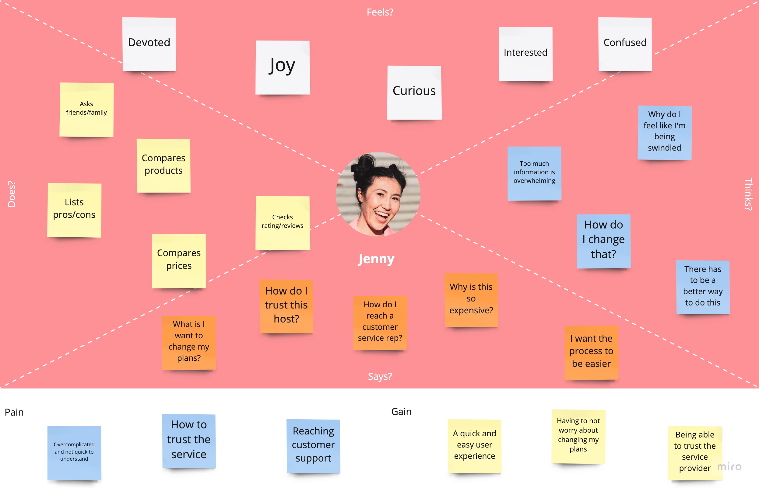
Following the research, I synthesized my research findings in order to better understand users and their problems. I examined my observations and findings to develop a user persona and an empathy map to summarize and communicate all my research findings in a human-centered way.


With a clearer understanding of the key business and user goals, and where they intersected. It was important to identify these shared goals and keep them in mind as I moved on to ideation and design phase.

2. Information Architecture
With a better understanding of the problems that needed solving, I generated ideas and potential solutions that would meet both user and business needs. Based on my research and synthesis, I decided to vertically integrate major airline flight databases into Airbnb's existing app atmosphere, as oppose to take a data feed from a consolidator or ticket wholesaler. This allowed me to create a superior user experience, because I could be more creative with the user interface, therefore staying consistent with Airbnb's brand. This is a harder, but smarter long-term business move as well, because Airbnb can become an airline super-connector and use the incoming leads of flights to up-sell customers on lodging, therefore having a more cost-effective funnel overall. Also, Airbnb might be able to list the airfares via Google Search at rates that are more cost-effective than what competitors could get.
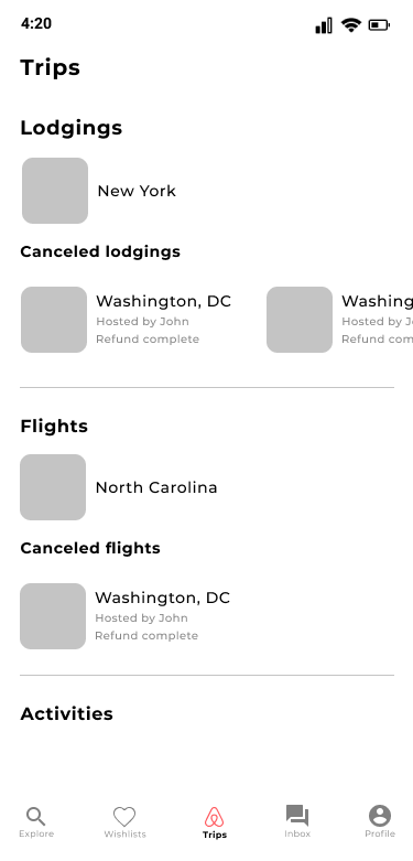
I started by creating a priority feature roadmap (which includes MVP and stretch goals) and then created three task flows. The first flow is for selecting and booking a flight starting from entering the app. The second flow is the specific examination of booking a roundtrip flight, which covers departure and arrival flights/fares and the ability to filter flight details. The third flow is how to view a booked flight, change or cancel a booked flight, and add a flight to an already booked home-stay.


I then designed an integrated high-level sitemap for the application’s information architecture, adding where flight information such as wishlist flights, already booked flights, and adding flights can be intuitively accessed.

3. Interaction Design
After defining the key pages and their content, I did some initial wireframing for the selecting and booking a flight flow, booking a roundtrip flight flow, and viewing a booked flight/changing or canceling a booked flight/adding a flight to a booked home-stay flow.


4. Prototyping & Testing
I ran usability testing on the application wireframe prototypes with users before proceeding to branding and UI design. I wrote up a usability test plan and made a low-fidelity Figma prototype. I wanted to test if my decisions around architecture and interactions would be intuitive for people to use and fit with the existing Airbnb user experience.
OBJECTIVES
1. Being able to browse and book a flight/fare is the number one business objective.
2. Being able to quickly access which flights/fares you thought were interesting is a nice-to-have feature for users.
3. Being able to view your upcoming flight and change or cancel it, is a primary business objective.
TASKS
1. Navigate from the homepage to browse flights and book a flight.
2. Navigate to your saved (wish-listed) flights and/or fares.
3. Navigate to your booked flight page and be able to change or cancel the flight(s).
QUANTITATIVE RESULTS
I had 5 participants test the prototype. All tasks had a 100% completion rate, and the error-free rates for tasks 1 through 3 were 67% (2 out of 3), 67% (2 out of 3), 100% (3 out of 3), 100% (3 out of 3), and 100% (3 out of 3), respectively.
QUALITATIVE RESULTS
After conducting one-on-one sessions, I noticed that if I simplified the filtering options when choosing a flight, it would help users digest the tedious information and make them feel less overwhelmed by choices to make. I gathered and organized several pages of qualitative findings in an affinity map to visually group and prioritize similar observations and feedback in a way that would help me zero in on the priority revisions intended to improve usability and the overall user experience.
From the results I gathered, I made an affinity map to help me pull out the common threads and recurring themes. I was then able to identify key insights and recommend revisions to address each one.

5. Iteration & Implementation
I iterated and implemented revisions gathered from the testing, resulting in updated wireframes and moved to branding & UI Design. Due to a tight deadline, I wasn’t able to run another round of testing otherwise I would’ve tested 5 more participants after the branding phase to learn and iterate more until achieving maximal results.
6. Branding & UI Design
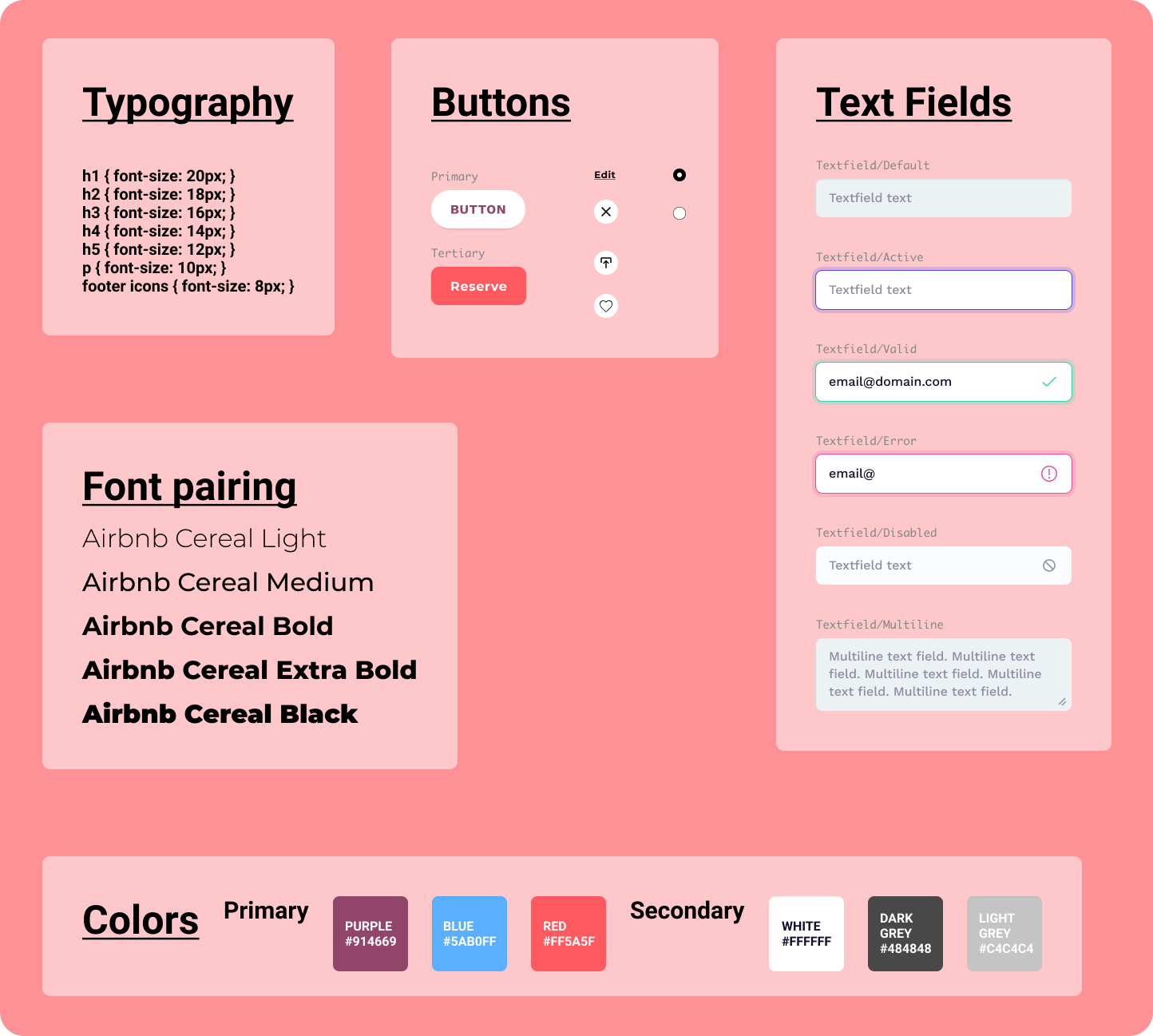
After testing, I researched Airbnb's design system. I tried to re-create a UI kit to match Airbnb's existing components, ranging from buttons to font sizes/weights to color palettes. I also tried to match Airbnb's custom Cereal typography the best I could.
I then created the high-fidelity prototype of the previously iterated user-tested wireframes. When designing the newly integrated pages to the existing app, I focused on Airbnb's brand identity and minimalistic feel, with touches of visually pertaining art, when dealing with the tedious amount of information architecture.


Conclusion
WHAT I DID
- Primary & secondary research
- Information architecture
- Wireframing & interaction design
- Prototyping & testing
- Iteration & implementation
- Branding & UI design
WHAT I DIDN'T DO
- Run multiple, 5 participate, rounds of usability testing
- Conducted A/B testing
- Design the “change flight” prototype
- Design the “cancel flight” prototype
- Re-test the updated hi-fi prototype
- Build the application
NEXT STEPS
- More usability testing and iteration
- Design more pages of the application, such as "change/cancel flight" pages.
- Show alternative routes for booking a flight from the homepage
User Flows:
Booking a flight flow
Selecting and booking a flight starting from entering the app.
Viewing wishlist flights flow
Specific examination of booking a roundtrip flight, which covers departing and arrival flights/fares and the ability to filter flight details.


